By Agustín Jofré – Graphic designer.
Not long ago I went to eat at a fairly new pizzeria in the neighborhood, and like any designer I started analyzing its image, its menu and its decor. I wondered how they'd managed to create and maintain a super simple (or minimalist) image that was nonetheless high-impact and high-recall. Well, actually I know how it's possible because I'm a designer, and that's why I want to put it in writing: to explain how and why a simple, high-recall visual style works.
What do you mean, champ?
Take a look at this Instagram post:
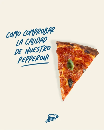
This image makes you really hungry, and I could talk about how pizzas are made, but I'm a designer at heart, so let's talk about the elements that make up the piece (not the pizza), and why it works.
Through a simple, texture-free background and a visually pleasant color harmony, our focus lands on the text and the image. If you close your eyes right now, you probably won't remember what the text says, but you will remember that there's a light background and a slice of pizza. That's what's called recall —what sticks in your brain the way cheese sticks to the roof of your mouth. It's also worth highlighting the use of the image with meaning and intent.
And that little logo I'm seeing —is it minimalist or simple?
Yes, next question.
Honestly, I don't like calling them minimalist, I prefer to call them simple. Minimalism is a visual style, and a simple logo doesn't necessarily have to be minimalist, even though the two concepts can go hand in hand. Logos are no longer complex, and that's a fact —there's already too much saturation in digital life and in real life. Let me take the chance to give an example: you get plenty of emails a day, probably full of offers; at the same time you open social media and there are tons of brands attacking your feed, with products, ads, videos and more; then you look out the window and see four billboards advertising different brands. Will you remember a single one of all the brands you saw today? If you do, I'm impressed by your memory. In my case I wouldn't remember any —maybe one, if it grabbed my attention. And this is exactly where a simple visual design pays off: the simple or minimalist brand that just wants to deliver a message stays in your mind longer. I guarantee you at least remember what the image at the start of the post is about.
Got more examples? Now I'm interested…
Enough with the pizzas, let's go through a few examples of logos that are simple and effective. I picked them based on my judgment as a professional designer and not on personal taste; you probably know some of these brands, but they all share the same common denominator. Simplicity.
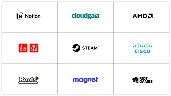
Looking at these little logos, we can already say they're not loaded with information, they're legible and easy to remember. They're really nice, sure, but what about messages or visual pieces? Don't worry, I've also got other examples —simple but effective. Each message is loaded with the brand's personality or intent, and it's easy to tell straight from the design. Yes, you noticed because there's nothing to distract you.
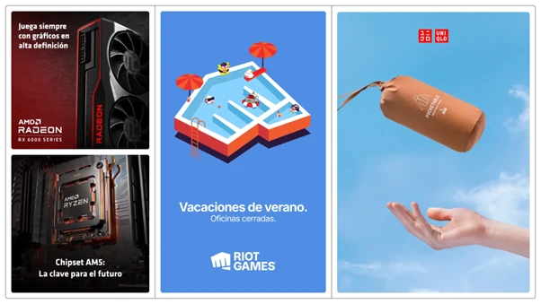
In each of them we find harmony —from the use of color, to the framing of the logo, to even leaving out typography to deliver the message— as if they were all offering us a kind of peace we're not used to having in our day to day. My favorite poster is the Uniqlo one; while I'm no great connoisseur of clothing brands, the message is clear without needing any text. Spoiler: I think the poster is trying to tell us that its jackets are light and easy to carry.
Great then, how do I pull this off for my brand?
Great question. First I'd define, as in my previous post, the tone, to know how to communicate, and then I'd ask myself: can your brand deliver a clear, direct message?
If the answer is yes, you already have the key element to focus on: the message. Playing with the brand's typography lets us center the audience on the message —we want them to read it, look at it, and have it stick. This example goes hand in hand with the Riot Games post in the image above. With a clear message, no fuss, simple and without too many bells and whistles.
If the answer is no, we've got a problem —your brand should be able to deliver a clear, direct message. But don't worry, all is not lost: if your brand can't communicate in a clear and direct way, you can focus your visual piece on something more abstract. Given digital saturation, you have to think about how not to turn the piece into just another in the crowd. For that, above all, you should try to make your visual piece elegant, sober and clean, with neutral colors —and I'll even accept a background image that describes a situation, a moment, or something that connects directly with the audience. In fact, you can ask yourself what effect do you want to create in whoever looks at it? In this case, the Uniqlo example is just what the doctor ordered.
And to wrap up, here are a few examples that don't work.
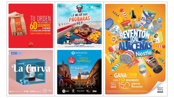
If you've started reading this part, do you remember the message of any of these pieces? Well, that's what I mean by digital saturation. Each of these posters or posts is packed with too much information alongside a message that isn't clear and/or is confusing, from the wording to the choice of images. The red poster is hard to read and to actually grasp the message —and that's despite the fact that I work with typography every single blessed day. The poster at the top center not only makes me hungry, but I have no idea who it belongs to, what brand it is, let alone the connection between food and a plane. The rest of the posters speak for themselves —I'll give you a few minutes to look at them again and try to decode the message.
Excellent then…
Remember: a message with recall isn't clever wording, it isn't a mental puzzle —it's a clear, direct message, paired with a good visual built with intent.