By Agustín Jofré – Graphic Designer, NSB Agency.
With a bit of time on my hands, and in a sort of design-driven introspection, I sat down to review the latest identities I've built. First, I was glad to see the wide range of colors I've brought into my workflow and into the way I think about and compose an identity, but then it struck me that every one of my identities uses a Sans Serif typeface.
It wasn't alarming, just curious, and it got me thinking: what's going on with Serifs?
But first, which is which?

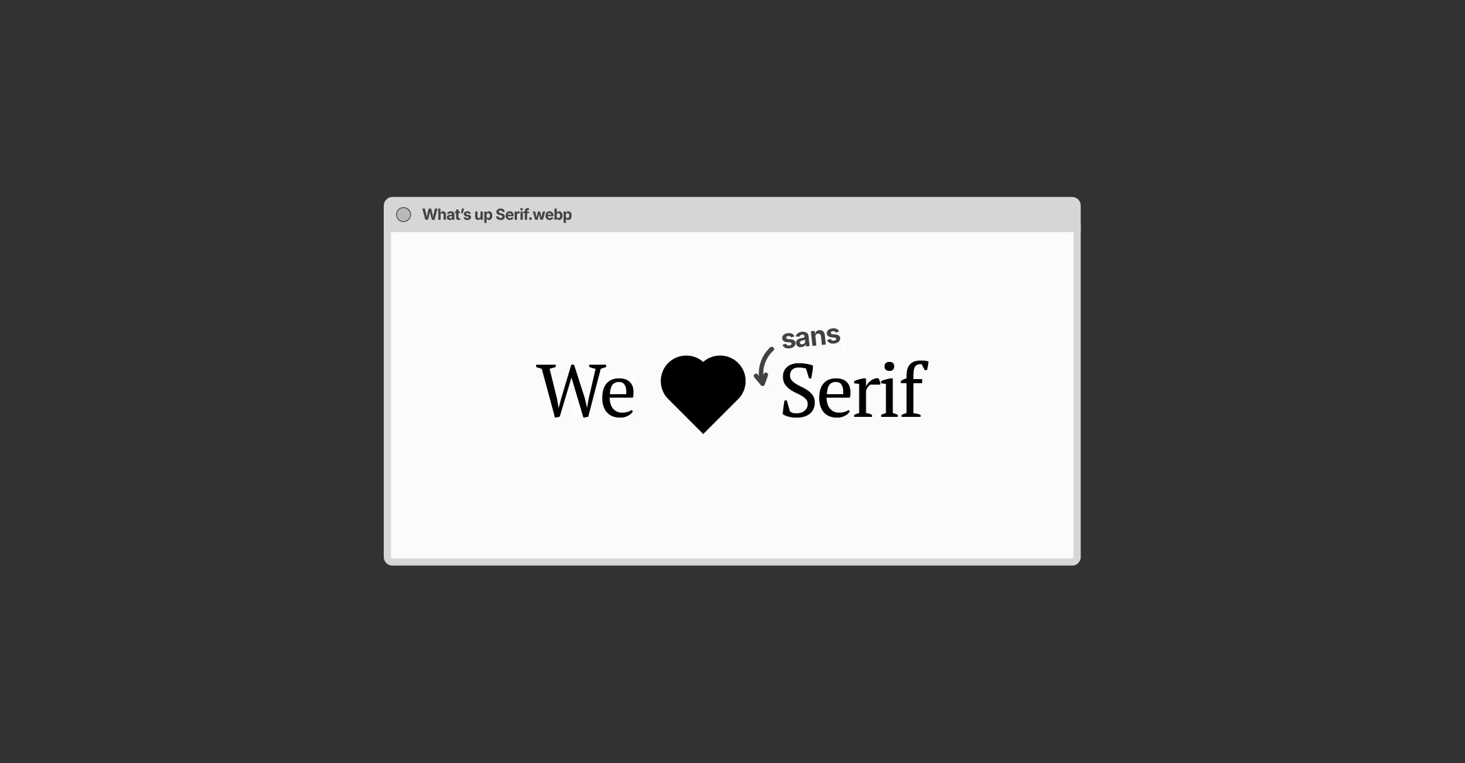
We can spot a Serif typeface by those little "feet" that the letters have at their endings. Look closely: the "S" on the left has a kind of flick, while the one on the right doesn't. That's Serif. Sans Serif, on the other hand, means "without serif." Thanks for coming to my TED talk.
In my opinion, Sans Serif typefaces carry more visual weight and volume, and tend to feel bolder and friendlier. Serifs, by contrast, look more traditional, serious, a touch sober, and with a character a little more like my own… but the key point is that they're no longer used much.
The sans-serification of brands
For a long time, brands used Serif typefaces to express their identity. Many even relied entirely on their typeface to build their visual system. And if you want to dig a little deeper into this, you can take a stroll over here, where I talk a bit more about brand personality. End of the commercial break.
Brands used Serif to convey tradition, authority and a touch of sophistication; while brands with Sans Serif came across as modern, simple and accessible. As if they split into camps: modern or traditional.
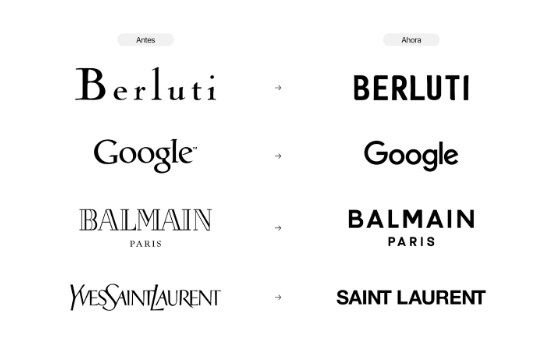
Today —and for quite some time now— brands have started migrating toward Sans Serif typefaces, dropping ligatures and simplifying their logos. This may be heavily influenced by the era we're living in: constant change, digital restlessness, screen-first focus and brands all fighting for the same window of attention.
The bet is on simplicity, direct communication, good legibility and easy recall. And I agree with that, but to show it more visually, I'm going to compare how some brands looked before and how they look now in terms of their logos. I promise not to criticize or over-analyze, I don't want to bore you…
So, what's the problem?
First off, I wouldn't call it a "problem"; I'd rather ask whether this visual homogenization actually works in today's world. And while I'm personally an advocate for prioritizing brand personality above everything else (and that's what my job depends on, isn't it?), today brands opt for typefaces like Sans Serif out of trend or, perhaps, because they're easier to scale across the infinite screen sizes out there.
But if every brand looks the same, how do they stand out?
I keep asking myself the same thing and, like any designer, I find a solution: experiment with Serif typefaces and give them scalability. It had to be said, so I said it.
We should look kindly on a brand that dares, that seeks to keep its essence as a foundation, because that's ground zero, and it shouldn't be set aside for the sake of a trend or oversaturation. I'd go further: becoming just another brand in the crowd is contributing to digital visual saturation.
Chin up: it's not all doom and gloom, there's hope
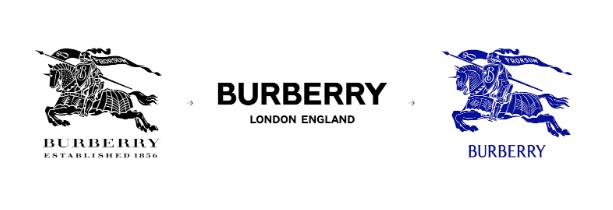
One of the brands I was going to put in the image above is Burberry. You probably know it —I didn't— but I came across it while researching for this piece.
Burberry ditched its stylized, powerful, sophisticated horse for a more minimalist Sans Serif typeface that, personally, I don't feel holds onto that elegance and essence.
Although —and very much in their favor— someone on the design team must have thought the same thing I did: Burberry didn't want to be just another brand in the crowd. They dared to bring back the gleaming knight on his steed, bearing a shield and a lance, in that shining armor, stylized, powerful, with strong lines and that elegance so typical of France (even though it's from England, I needed the rhyme).
So… keep on serifing?
That's right: in my upcoming identities I'm going to put forward proposals aligned with what the brand is after, but seizing the chance to showcase Serif typefaces. As a form of protest, maybe; as a way of not being just another in the crowd; or as a typographic exercise to train the eye of whoever looks at a brand.
We have the tools, we have the expertise and we have the drive to keep your brand from being just another in the crowd.
And I'm all for Serifs.