By Agustín Jofré – Graphic designer.
When we set out to create a brand, we often focus on making it pretty, or impactful, or on making it sell a lot, but what we don't always consider is how a brand should behave, who it should be and how it should communicate with its audience. That's why in this piece I want to share my take on the different brand personalities through design. (Yes, I'm a designer.)
First things first: what is brand personality?
Technically, it's a set of human characteristics, traits and behavior patterns that shape how people perceive the brand. You could say it's the way the brand speaks, acts and addresses its audience. To put it even more simply, I'd say it's the personification of a brand, but that doesn't mean the brand has to be or have a defined character.
I like to group personalities in the following ways, and mind you, I'm not saying these are the only ones, who's to say a brand can't have more than one personality?
Revolutionary or innovative personalities:
These are the brands that, right out of the gate, want to show something new; through their tone they never stop telling you what and how their products or services innovate. They're brands that want to be pioneers, front-runners and leaders in their field, and to do that they have to show they know what they're doing.
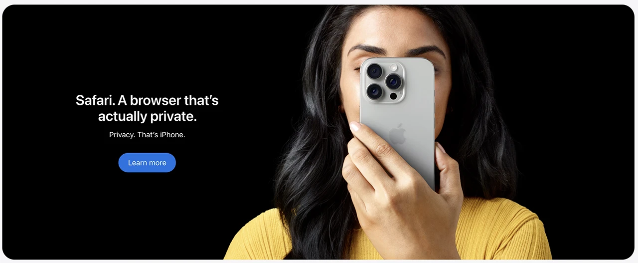
To give a concrete example: Apple (yes, the little apple). And how do we translate that into design? Easy (in this case). Apple managed to create and sustain, for a long time, a simple, minimalist and elegant image.
From its logo, which initially showed an apple falling from a tree as a nod to Isaac Newton's innovation and his theory, they kept the central idea of the apple while adapting it to each era, moving through many visual styles.
By using lots of white in their communications, they're already showing us their intentions: innovation, simplicity, ease of use. When they use black as a background, they show us that they're exclusive and pioneering.
And finally, the wording (or brand tone): Apple found a way to be technical while staying friendly, even coining names for concepts that already existed. You'll notice it when you read their product colors — if a product is Blue, it's just ordinary, but if it's Sky Deep Blue it gives you the feeling of being unique.
Honest and transparent personalities:
These are the brands that take a transparent, honest approach to attract and connect with their audience; they're empathetic and understanding. They're like that high school classmate who, whenever you asked for help with homework, would help you just because they were a good person.
These brands seek to help their consumers, not just with their products, but by keeping them in mind when developing new campaigns, products and so on.
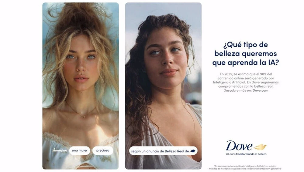
The first brand that comes to mind as I write this is Dove. Many of us know it for its marketing campaigns and posters, which are precisely designed to help its consumers and to convey that honesty in every campaign, while also seeking to leave a mark, a vision, to spark a conversation. And all of that is reflected in the design behind their campaigns — once again we see honest, simple design, where the connection is mainly photographic and typographic.
If we analyze the colors, we have gold, blue and white elements, with gold representing prestige, honor, worth and pride, blue representing calm, commitment and order, while white represents innovation, positivity and elegance.
If we put all the pieces together like a puzzle, we get that honest, transparent, sincere personality — and we all want that to be the one looking after our skin.
Luxury and wealth personalities:
Personally they're not my favorites, but they sure are effective (and how). These are the ones that, as the name suggests, aim to sell luxury products or services.
For example, Rolex is a brand with a personality that seeks to make its audience feel powerful, as if those who wear its products already belong to that select group you can only join by buying what they sell.
They use fairly clipped communication, saying no more than they need to; they don't need to talk about their values in every campaign — it would be like a person who doesn't talk to just anyone, and that's something that doesn't bother you.
When it comes to design, we can see it reflected in an obvious way, since the logo is a crown, and I ask myself: what's more luxurious and powerful than a golden crown?
Looking at the colors, this time we see a new member among the colors we've been seeing: jade green. Well, the "jade" part I added myself, and it's precisely my own perception; the green aims to come across as sophisticated, organic and ethical.
Another important element of this brand worth highlighting is the typographic decision. Serif typefaces (or the ones with those little feet, as my little sister calls them) have always been associated with luxury brands, since they carry a certain elegance in their modulation, they're easy to read and they're not so widely used nowadays.
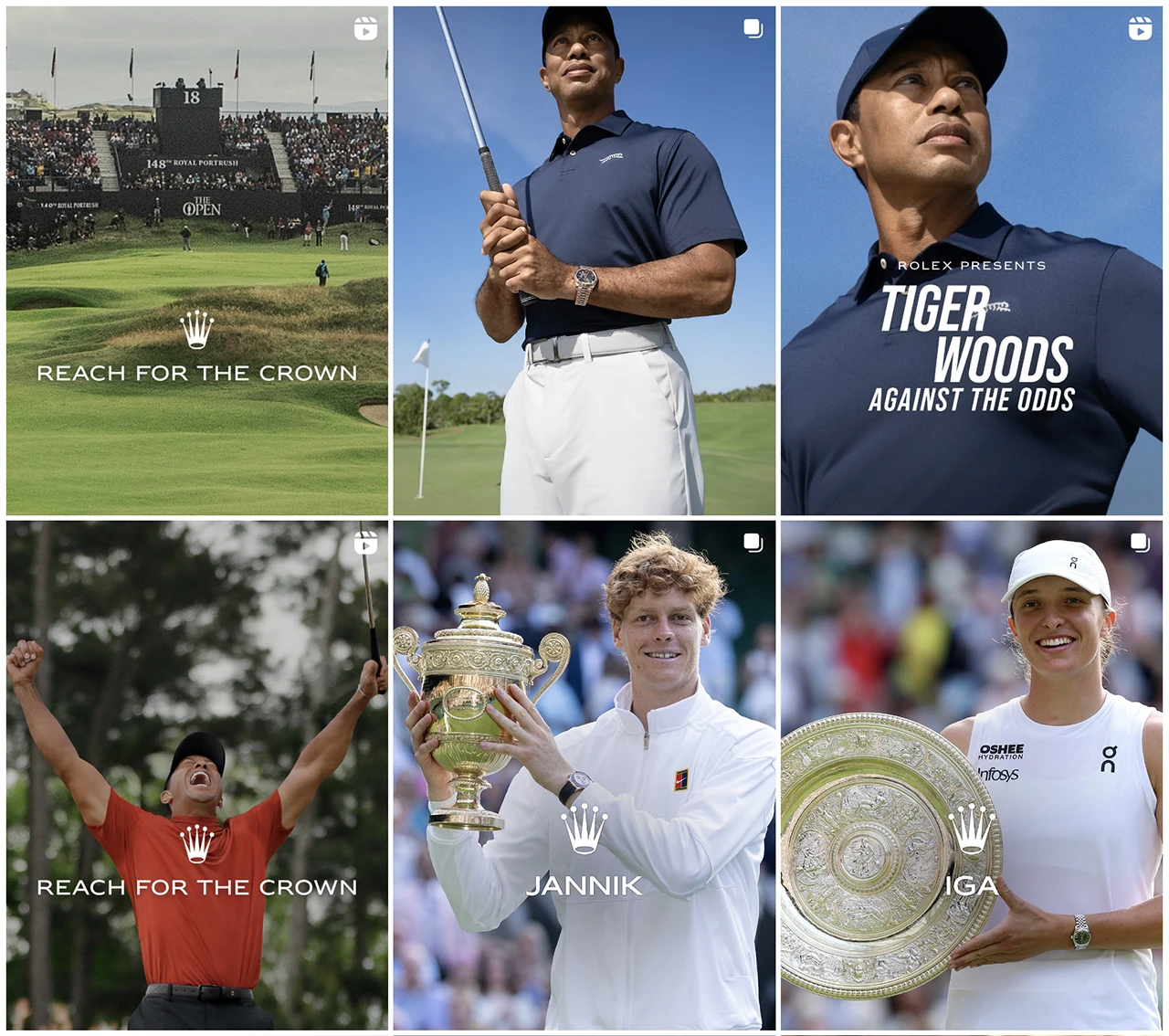
I found it fun to look at their Instagram, because it's interesting and curious how they don't present themselves as the brand, but rather as the companion. For example, showing how Jannik and Iga won gold on their own merit — they're unique, and they also wear a Rolex, so they already belong to that select group. To be honest, I expected to see a catalog of watches and got a pleasant surprise.
Emerging or disruptive personalities:
Here comes the personality I like most as a professional. These are the brands that aren't afraid, brands that are honest without being aggressive, brands that even want to be different. If I had to describe it as a person, it would be that cool cousin who has no problem talking about anything at family gatherings.
Emerging or disruptive brands seek to empathize with new generations, and don't try to copy something already established. (They're my favorites to design because they're the hardest to pull off — it's not easy to stand out these days with so much content already out there.)
Several examples come to mind. First I thought of Spotify, but I find it pretty weak as a disruptive personality, so then I came up with Netflix. It's that brand we all already know, and that we only use to watch media, but it's a brand with a personality that's bold without being arrogant, charismatic and sometimes even a little sharp. It seeks to connect with its audience in various ways (some not so friendly, as you'll see) to grab attention and get people to watch its content.
When it comes to visual elements, I can name them from memory (yes, I watch a fair bit of Netflix): it's a brand that uses minimalism loaded with intention. The red N on black is used as an icon that, once seen, you can never erase from your mind (it's called salience if we get technical), while the word Netflix in red aims to convey passion, warmth, excitement, anger, power, joy, alarm and more. Now there's a color — it's the one that can transmit the most emotions, and it's a smart choice.
And when it's time to show their tone, they clearly want to grab attention.

OK, so how do I build a personality through design?
Easy: get in touch with us. Or well, since this is a blog post, I can give you a few tips to keep in mind when designing your brand with personality. (Disclaimer: these steps aren't to be followed to the letter; take them instead as a visual reference. At the end of the day, this is my view as a professional, not as a business owner.).
- Research first, always
It all starts with research. Analyzing the market, studying the competition, reading reviews, spotting trends. Not to copy, but to understand where we're stepping in.
- Define the differentiator
Once you understand the terrain, it's time to decide what makes our brand unique. This is the creative moment: how do we stand out? Why choose us? Example: if I create a brand of eco-friendly soaps, the differentiator could be a sharp, honest tone in its communication. A clean brand, but with some spice.
- Design the identity
Here's where design comes in. With the differentiator defined, you work on name, logo, colors, typography, tone. Back to the soap: no greens. I'd go for oranges or yellows that convey energy and provocation. Spoiler: a piece is coming about the backlash against sans-serif typefaces.
- Campaigns with meaning
With the identity ready, you move on to Marketing. It's more fluid because we already have a solid foundation. Campaigns can provoke, start healthy conversations or debates. The idea: to show who we are and what we want to say.
- Learn from the market
Once the brand is out there, we analyze. What worked? What didn't? What can we improve? We evaluate the performance and prepare the next step with more clarity.
- Evolve without losing your essence
Launching is just the beginning. The brand has to adapt, innovate and stay true to its personality. Evolve with style.
That's my report.
Thanks for making it to the end, and let me tell you that at NSB we've created (myself included) plenty of brands with different personalities. I invite you to take a look at our portfolio and discover more.